Overview
In writing about visualizing survey data using Tableau I’ve found that the number one impediment to success is getting the data in the right format. In accompanying posts I’ll explain how to get this done using Tableau Prep, Alteryx, Easymorph, and Tableau 10.x.
What do I mean by “just so”?
When I deal with survey data there are usually four different elements that need to fit together:
- The demographic information (e.g., age of respondents, gender, etc.)
- Survey responses in text format
- Survey responses in numeric format
- Meta data that describes the survey data.
Let’s see what the four elements look like using an Excel sample data set (click here to download).
Demographic data
Here’s what the demographic data looks like.
Survey responses in text format
Here are several columns of survey responses in text format. Column F contains data for a Yes / No / Don’t know question. Column G contains responses for a question about salary. Columns H through P are responses for check-all-that apply questions and columns Q and R contain Likert scale responses.
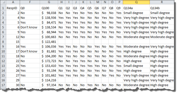
Survey responses in numeric format
Here are the same responses but in numeric format.
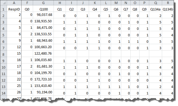
I’ll explain why it’s so useful to have the survey responses in both text and numeric format in a bit.
Meta Data (the “helper” file)
Here’s some data that I usually prepare by hand as most survey tools won’t produce it for me automatically. Having this helps me understand the data and will greatly streamline my work in Tableau.

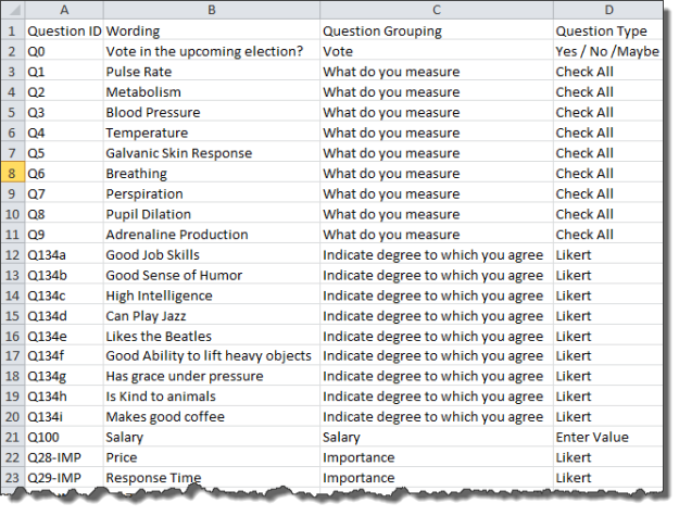
Figure 4 — Survey data meta data. This doesn’t take long to create and will be a huge time saver once we get the data into Tableau.
What does “just so” look like?
Our goal is to combine and reshape the various elements so that they look like this.

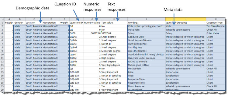
Figure 5 — Reshaped data joined with meta data. Survey data in this format is very easy to use with Tableau.
As I’ve written previously, the key thing is that I no longer have a separate column for each survey response. Indeed, I’ve reduced the number of columns from 45 to just 11, but I’ve also increased the number of rows from 845 to over 25,000. That is a good thing.
Why this works so well with Tableau
Our goal is to see how to use our preparation tool to get the data in this format, not to actually use the data, but if you need convincing on why the meta data is so helpful, consider the following example.
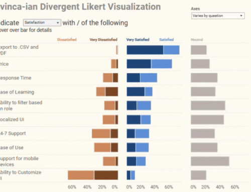
Let’s say that in your survey you ask people to indicate the importance and satisfaction about certain services, as shown here.
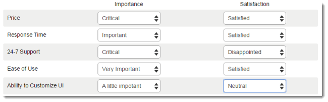
With the data set up “just so” conducting this comparison in Tableau becomes easy. First we can drag Question Grouping into Filters and indicate that we just want to look at Importance and Satisfaction questions.
Then we can drag Wording and Question Grouping onto the Rows shelf which gives us the framework for comparing importance and satisfaction across ten different questions. No more having to “look up” which questions we want to explore and no more having to alias question IDs. I love this!

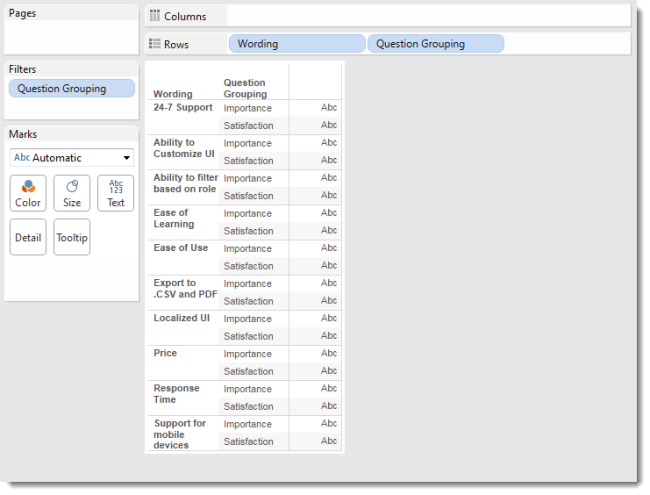
Figure 8 – The helper file meta data provides the framework for comparing questions and building visualizations.
Why do we need both text and numeric results?
We don’t really need them, but I know I certainly want them.
Consider all of the Likert scale question results. The universe of possible values are
1
2
3
4
5
Suppose we want to know just what each of the values (1, 2, 3, 4 and 5) stand for? The problem is that it depends on the question being asked as sometimes a 5 means “Strongly agree”, for other questions it means “Critical” and for others it means “Extremely satisfied”.
Without having both numeric and text results we will have to write A LOT of IF / CASE statements and I, for one, do not want to do that.
So, now that we understand how and why we want the data “just so” we’ll see how to get it that way using Tableau Prep, Alteryx, Easymorph, and Tableau 10.x.
[…] part one we discussed an optimal format for survey data in Tableau. In this part we’ll look at the Alteryx […]
[…] Alteryx (Best-in-class but it has its own learning curve and is […]
[…] If you’re not sure what this means, please review this post. […]
How would you recommend configuring survey response data for a survey that includes text responses and, more importantly, a “choose up to three” style question? When the data is converted to a vertical format, how do you take care of those empty values?
Kyle,
You are describing a check-all-that-apply question where people can choose up to one things.
In an ideal universe these should be coded as 1s and 0s or yes / no. Several survey tools code these as 1s and blanks (nulls). BAD tools, Bad!
I’ve written a post on how to handle this here:
https://www.datarevelations.com/checkallcoding.html
Steve
Thank you so much for this awesome post!!!! i am working with the pew social media survey data set and this is really helpful
This is excellent, and i found it very useful for performing survey analysis i would normally have resigned to doing in excel.
Have you considered writing a template / workflow that allows you to automate the somewhat laborious process of data restructuring (in particular for less advanced users)
Archie,
Because every survey tool is a little bit different, coming up with a universal template will be tricky.
I do have blog posts that explain how to tackle this using different tools (e.g., EasyMorph and Alteryx). They are not very complicated workflows and easy to replicate.
Steve
Great article Steve! Used it together with your tutorial on using EasyMorph for wrangling survey data – and it really worked like a charm! Thanks for taking the time for putting these valuable resources together!
Delighted you found it helpful.
[…] If this is all new to you, please see Getting Survey Data “Just So.” […]
Hi Steve
Thanks for the blog post, very helpful. I managed to get the numeric and text field aligned. However, when I join the helper file, the demographic questions are left as mis-matched fields. Any ideas why this would be please?
Best wishes
Colin
Colin,
Sorry for the late reply. As the demographic fields are not pivoted but remain as separate columns you will not end up connecting them in the helper file. It won’t break anything to have them in the helper file, but you’ll get some error notifications.
Steve
Hi Steve
Thanks for your reply. I kept the relevant demographic fields as un-pivoted and can now use them for cross – tabulation. However, where I struggled with this is where the demographic question is a check all that applies type as they get split into separate questions when left un-pivoted.
I agree Tableau Prep makes the whole process a lot easier!
Best wishes
Colin
Do you have any tips for dealing with survey questions organized as matrices? Or as Loop & Merge data? I’m struggling greatly to get my data “just so” with these types of questions in the survey.
See https://youtu.be/ORyAZTmQ4nk?t=2524
(From my 2018 presentation at the Tableau Conference)
And here’s a link to all the files / PowerPoint presentation: https://datarevelations.com/Files/NewSurveyData_DataRevelations.zip
Steve
Thank you for this blog post, it is incredibly useful.
Is it possible to have a visualization for one multiselect question while filtering by another? I have tried so many different ways at this and have not been able to figure it out. It seems that with the tall format this may not be possible, but I figured I would reach out and see.
Thank you,
Courtney
Courtney,
Sorry for the delay getting back to you.
I’m way overdue to write a blog post on this, but can point you to two things that may help.
First, here’s a recording from my presentation at the 2018 Tableau conference. I’ve queued it to the portion that I think is applicable:
https://www.youtube.com/watch?v=ORyAZTmQ4nk&feature=youtu.be&t=3125
BTW, if you go to the survey data page on my website you will find the workbooks that I reference.
You may also find this post useful: https://www.datarevelations.com/intra-question-1.html
I do hope to have more about this soon and hope that what I’ve referenced here will help.
Kindest regards,
Steve
Hi Steve,
This is great! By chance do you have any posts on creating the Meta Data (“helper file”) beyond the figure shown above?
Thanks,
Breannon
Breannon,
I’m able to get most of what I need for the meta data helper file by copying and pasting things (and usually transposing when I paste) from whatever survey tool is being used. I don’t think I’ve ever head to build one of these things completely from scratch.
Steve
Your posts and suggestions for dealing with survey data are very useful. The one question I am trying to keep from learning the hard way is handling of data input questions where metrics need to be computed from the values entered.
I have a survey that has a mix of demographic, Likert, multiple choice, and data input values (e.g. How many volunteers, hours worked in xxxx,….).
I’ve pivoted the data similar to your suggestions and it has made visualizing certain data types super easy.
However, I also pivoted all of the numeric input responses as well which is now making the creation of metrics more difficult since the metric value has to be derived by a specif dimension vs separate columns. Hopefully, this makes sense. Any suggestions for handling this in Tableau? I’ve debating bringing in those input values in as a sperate non-pivoted data source vs creating a bunch of more complex LOD type calculations. Is there recommended practice around this?
Don,
It sounds like you are trying to visualize the results of benchmarking questions (e.g., “what was your salary?”, “how many hours a week to you spend watching TV”). I think this is one of the easiest types of questions as you can compute the average, median, or do create a stripplot, jitterplot, or stripplot showing the spread of all results. Here’s an example from the Data Visualization Society annual survey. https://public.tableau.com/views/DataRevelations_DataVizSociety_Survey2019/BenchmarkingSalary?:display_count=y&:origin=viz_share_link
Yes and thank you for sharing the example. I think visualizing the raw data is relatively simple–esp with the great examples you have provided on the DataRevelations site. Where I start to get challenged is creating a multitude of calculated metrics from the pivoted raw data where its less about sum of salary or median of Salary but say for example “No of Volunteers per Patient” where its derived from two or more survey input values. Easy to do when not pivoted, but when the data is pivoted I get all sorts of strange results. I know its me in just learning how to best do this in tableau–I just have not seen a bunch of examples to clear up the confusion in my head.
Thanks for the guidance!
Hi Steve,
Great article, Thanks for your guidance on this topic, and many others I have been facing in my short time using Tableau. I do have a question relating to the Likert scale type. How do you recommend handling “Not Applicable”?
Changing them to NULL seems the easiest method but is of course not representative of the actual situation, where a person did take time to provide an answer. Recoding to 0 impacts all calculations as well.
Stefan,
I’ve written lots of stuff on how to visualize Likert data and agree NA is different than did not respond. As of this week I advocate placing neutrals on the side (see https://www.datarevelations.com/resources/got-likert-data-neutrals/). I don’t see why we can’t place NAs in their own column as well.
That said, I think that is a separate analysis as it will tell you for how many people the issue just doesn’t matter. Then you can write “as for the 72% of folks for whom this issue *does* matter, here’s what they think.”