View by:
Check All That Apply Visualizations
Whitepapers, Courses, and Presentations

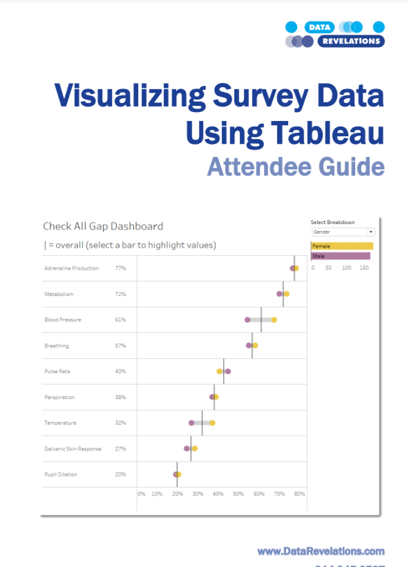
Visualizing Survey Data Whitepaper
An updated version of Tableau’s whitepaper on visualizing survey data (written by Steve Wexler of Data Revelations)
Download Survey Data Whitepaper
On-demand course: Visualizing Survey Data Using Tableau
In this intensive hands-on course, participants will learn both best practices in survey data visualization and how to use Tableau to render these visualizations.
What does “good” look like when visualizing survey data (Part I)
In this video we look at several ways to visualize a check-all-that-apply question, including a rank and magnitude dashboard and a connected dot plot dashboard.
What does “good” look like when visualizing survey data (Part II)
In this video we look at several ways to visualize Likert scale questions.
General Survey Considerations

WTF? Why doesn’t this survey data stuff work?
Read this first.

Getting Survey Data “Just So”
A review of how and why survey data should be formatted a certain way

Getting Survey Data “Just So” using Tableau Prep
How to use Tableau Prep to get survey data in an optimal format

Getting Survey Data “Just So” Using EasyMorph
How to use EasyMorph to get survey data in an optimal format

Getting Survey Data “Just So” Using Alteryx
How to use Alteryx to get survey data in an optimal format

Using Qualtrics’ Web Data Connector
How to use Qualtrics’ web data connector with Tableau

The Second Thing You Should Do When Working with Survey Data
Once you get the data “just so” you should do this.

Getting SurveyMonkey data to play nicely with Tableau
This posts addresses the idiosyncrasies of downloading SurveyMonkey data and getting it “just so” so that it will work well with Tableau.

12 fascinating findings from the DVS 2019 community survey
My approach to visualizing 1,300+ responses to the DVS annual survey.

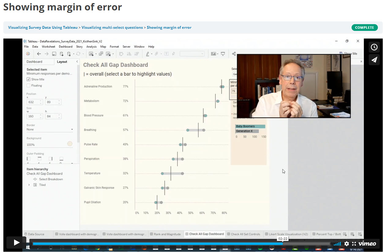
Showing uncertainty in Survey Results
There’s always a margin of error in survey results. Here’s how you can show those error bars in Tableau.

More thoughts on displaying Margin of Error in survey data with Tableau
Some more thoughts and approaches to showing Margin or Error.

Decluttering by making the first row different from the other rows
A simple way to add those percentage or currency symbols to the first row of your display

Intra-question analysis –Cut and filter any question by any other question (Part 1)
Cut and filter any question by any other question.

When Filtering Produces Too Few Responses
What to do when extreme filtering reduces the number of responses so much that the results are statistically

Visualizing Uncertainty in Longitudinal Survey Data
Help your stakeholders see just what plus-or-minus X points looks like with respect to Likert responses over time.

How Many People Selected 1, 2, 3 … N Items?
And what did they choose? Very useful technique for finding some surprises in check-all-that-apply questions.

Working with Weighted Survey Data
How to modify your formulas to deal with weighted responses.

Set Controls and survey data – how to compare responses for this group vs that group vs overall
How to compare filtered and unfiltered vs. overall results in the same visualization.

Comparing a target group with the entire population
How to compare filtered and unfiltered results in the same visualization.

Showing Percentages? Lookout for these pitfalls
Two very useful techniques to combat Tableau’s auto-sizing axes.

Statistical Significance
How to show that changes from a previous period are statistically significant.
Check All That Apply Visualizations

How to Visualize Check-All-That-Apply Questions in Tableau
How to fashion a simple calculation that will work with regular and weighted data.

Dealing with Survey Tools that Don’t Code Check-all-that-apply Questions Correctly
How to deal with survey tools that code 1s and blanks instead of 1s and 0s. SurveyMonkey users, this is for you.

Breaking down the results of a question by a check-all-that-apply question
How to use Tableau’s Relationship feature to cut / filter questions by check-all-that-apply questions.

Using Google Forms for Survey Data with Tableau
How to deal with the unfriendly way that Google Forms encodes check-all-that-apply questions.
Likert Scale and Divergent Stacked Bar Visualizations

How to visualizing Likert scale data in Tableau
Why I think people should visualizing Likert scale data this way.

Rethinking the divergent stacked bar chart
There’s a good case for place the stronger views in the center.

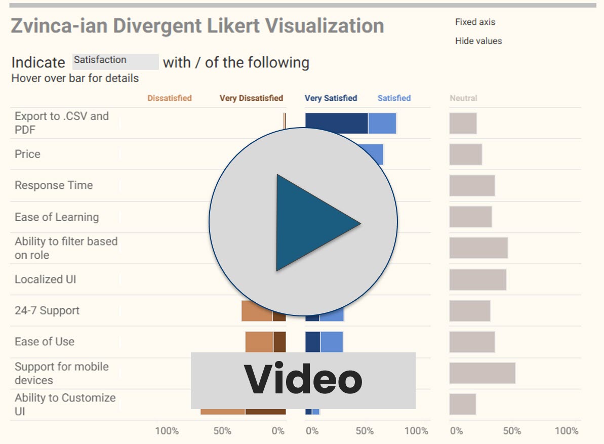
Likert Scale Questions the Zvinca Way
An alternative, and I think better, approach to presenting Likert scale data

Don’t Ignore the Neutrals!
Dealing with polarized survey responses and the importance of highlighting neutrals (or lack thereof.)

Got Likert data? Put the Neutrals on the side
More thoughts on how to visualize this type of data.

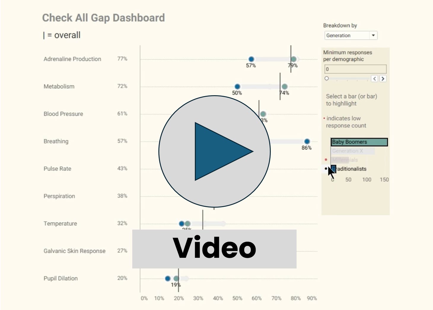
How to visualize Likert scale data broken down by different demographics
The gap chart (aka, “barbell chart” or “connected dot plot”) is my choice for this.

A better way to connect the dots
The gap chart (aka, “connected dot plot) is a great way to show differences within selected demographics, but what do you do if the values are the same or nearly the same?

Visualizing Importance vs. Satisfaction
Both use Likert scales and both have to be shown at the same time to be able to make comparisons. Here are several approaches.

Visualizing Sentiment and Inclination
Dealing with different sentiment scales (NPS, Likert, Top 3 minus Bottom 3, etc.) and showing sentiment and inclination over time.

Visualizing Net Promoter Score data
Using a divergent stacked bar chart with NPS overlap to make the data clearer
Benchmarking and Visual Ranking
Seeing thing with fresh eyes
Why I still love the jitterplot

Is this better than a Jitterplot? Could be
Check out the unit histogram / Wilkinson dot plot.

Visual Ranking within a Category
Technique to show how responses rank when broken down by different dimensions. Great technique for showing rank and magnitude at the same time.